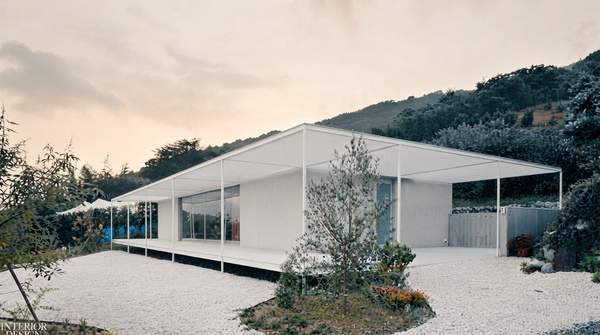
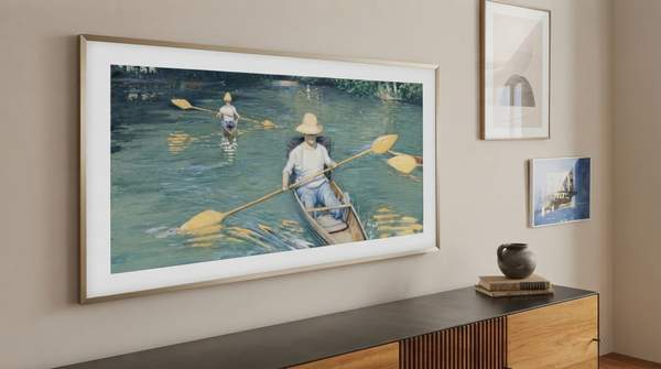
In a surprising twist, a university study found that students developed a preference for the specific color scheme of the residence hall they lived in, challenging the notion that color preference is purely innate. Prolonged exposure to certain hues within an environment can subtly, yet significantly, shape an individual's aesthetic inclinations. Our surroundings can deeply influence our perceptions, often without conscious awareness.
Many assume color preference is entirely subjective and personal, rooted solely in individual taste. However, scientific studies reveal consistent patterns in how humans respond to different colors. These investigations also demonstrate the powerful role of environmental conditioning in shaping color biases, moving beyond simple personal likes or dislikes.
Relying solely on personal taste for interior color choices risks missing opportunities to intentionally shape mood and productivity, suggesting a more data-driven approach to design is beneficial. Interior design's strategic color choices are not merely aesthetic but are a potent, underutilized tool for subtly conditioning human preferences and influencing psychological states, often without conscious awareness.
Beyond Aesthetics: What Color Psychology Really Is
Color psychology, as a field, systematically studies how colors influence human behavior, emotions, and perceptions. According to Belysse, colors can stimulate emotional responses and influence productivity, energy levels, mood, and self-esteem. Color is not merely decorative but a powerful, often subconscious, driver of our inner states and outward behaviors.
The impact of color extends beyond immediate visual appeal. It can affect physiological responses, such as heart rate and body temperature, and psychological states like alertness or relaxation. The colors surrounding us in our daily environments are constantly, if subtly, shaping our experiences and reactions to the world.
Understanding color psychology allows designers to move past arbitrary choices. It provides a framework for creating spaces that actively support specific human needs and activities, from promoting focus in an office to fostering tranquility in a bedroom. The strategic application of color, therefore, becomes a measurable opportunity to enhance well-being and performance.
How Scientists Study Color's Hidden Influence
Scientists employ various methodologies to investigate the psychological effects of color, lending credibility to the field. Virtual reality (VR) experimental environments are increasingly adopted for simulating color variations in indoor spaces to eliminate external factors and allow for more controllable study of color effects, according to Nature. Virtual reality (VR) experimental environments are crucial for isolating color's impact, moving the field beyond anecdotal evidence to empirical data.
Using VR, researchers can precisely control lighting, saturation, and hue, ensuring that participants' responses are attributed solely to the color changes. Precise control over lighting, saturation, and hue minimizes confounding variables that might exist in real-world settings, such as furniture, décor, or natural light variations. Such precision allows for the collection of more reliable data on how specific colors affect human cognition and emotion.
The shift towards empirical, controlled studies underscores a scientific movement from viewing color choice as purely subjective to recognizing its measurable and controllable impact on human experience. A rigorous approach helps to establish consistent patterns in color perception, which can then inform practical applications in interior design and architecture.
Unpacking Universal Preferences: The Allure of Blue
Despite the influence of environmental conditioning, specific patterns in color preference do emerge consistently across different studies. For instance, a study conducted in a university residence hall found a preference for blue interiors, followed by green, violet, orange, yellow, and red, according to PMC. The consistent preference for blue and green suggests a potential evolutionary or cultural basis for these calming and natural hues in interior spaces.
Blue often associates with the sky and water, evoking feelings of serenity, stability, and peacefulness. Green, linked to nature and growth, tends to promote a sense of balance and harmony. These associations are deeply ingrained, contributing to their widespread appeal in environments designed for relaxation or concentration.
However, the same PMC study also noted that students developed a preference bias for the specific color of the building they lived in. While there might be innate or widely accepted color preferences, environmental exposure can significantly override or at least strongly influence these general tendencies, suggesting conditioning can be more powerful than baseline preferences. Specific, repeated exposure to certain colors in daily environments can significantly alter these baseline preferences, demonstrating the powerful, adaptive nature of human perception.
Beyond Broad Strokes: Individual and Cultural Nuances
While general patterns in color preference exist, individual differences and cultural contexts also play a significant role, making the application of color psychology nuanced. For example, gender differences emerged for the preference of blue and violet, according to PMC. Demographic variations are crucial for designers to tailor color schemes effectively, moving beyond one-size-fits-all approaches.
Cultural background also heavily influences how colors are perceived and interpreted. A color that signifies good fortune in one culture might represent mourning in another. Designers must consider these diverse associations to create inclusive and contextually appropriate environments that resonate positively with their intended occupants.
The complexity of color psychology is highlighted by the interplay between universal preferences, individual characteristics, and cultural meanings. Effective design requires a deep understanding of these layers, enabling the creation of spaces that are not only aesthetically pleasing but also psychologically optimized for their specific users.
Common Questions About Color and Mood
How does color affect mood in interior design?
Color affects mood by influencing physiological responses and psychological associations. For instance, warm colors like red and orange can elevate heart rate and create a sense of energy or excitement, while cool colors such as blue and green tend to lower heart rate and promote feelings of calm and relaxation. These effects are often subconscious, subtly guiding our emotional states within a space.
What colors promote calmness in a room?
Colors like light blues, soft greens, and muted grays are highly effective in promoting calmness. Light blues are often associated with the sky and water, evoking tranquility, while soft greens connect to nature, fostering a sense of balance and peace. These hues can reduce stress and create a serene atmosphere, making them ideal for bedrooms or meditation spaces.
Which colors increase energy levels in a home?
Vibrant colors such as bright reds, oranges, and yellows can significantly increase energy levels and stimulate activity in a home. Red is known to enhance vitality and passion, orange can boost enthusiasm and creativity, and yellow often brings feelings of happiness and optimism. These energizing colors are suitable for areas like home gyms, creative studios, or dining rooms where social interaction is desired.
What is the psychology of blue in interior design?
The psychology of blue in interior design centers on its ability to evoke feelings of tranquility, stability, and trust. It is often associated with the sky and ocean, promoting a sense of peace, order, and professionalism. Light shades of blue can make a room feel expansive and airy, while deeper blues offer a sense of sophistication and depth, making it a versatile choice for various environments.
Designing for Well-being: The Future of Color
The finding that students developed a preference for the color of their residence hall demonstrates that interior designers are not just decorating spaces but subtly programming human preferences, making their choices a powerful, often unconscious, form of behavioral influence. Companies and institutions failing to strategically design their environments with color are missing a measurable opportunity to enhance well-being and performance, an insight combined with the evidence that colors influence productivity and mood.
The increasing use of virtual reality to simulate and study color effects, alongside evidence of environmentally conditioned preferences, indicates a scientific shift from viewing color choice as purely subjective to recognizing its measurable and controllable impact on human experience. An evolution in understanding allows for a more intentional approach to design, where color is a tool for optimizing human states.
By consciously integrating color psychology, we can transform spaces from merely functional to actively supportive of human well-being and productivity. This strategy.tegic application of color extends beyond individual preferences, creating environments that universally uplift and optimize human experience. Publications like Form & Taste will continue to explore how intentional color schemes optimize living and working environments, guiding readers toward informed design choices.