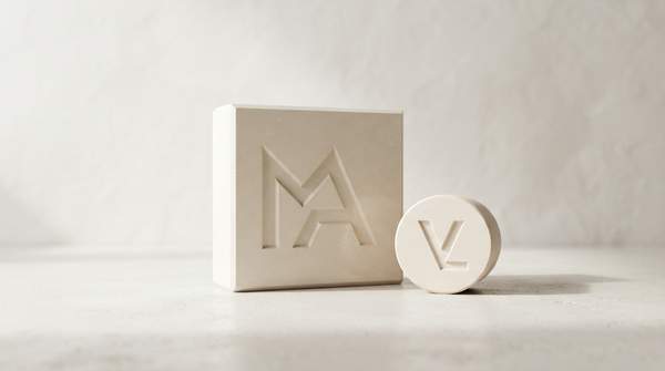
Luxury logos are shedding their ornament. Across the Western luxury fashion and goods sector, brands have been trading serif typefaces and elaborate crests for flat, all-caps, sans-serif wordmarks — and the change is not merely aesthetic. It is a semiotic shift: the same design elements that once signified heritage and exclusivity now risk reading as outdated, while minimalism signals modernity, accessibility and digital fluency. Understanding why requires looking at logos as language.
The Language of Luxury: Understanding Logo Semiotics
Semiotics, the study of signs, treats a logo not as decoration but as a carrier of meaning: a form that points toward values the brand wants consumers to absorb. Research on luxury brand heritage argues that although there is little consensus about applied semiotic phenomena in luxury, the semiotic concept is an essential and inevitable part of how luxury brands construct heritage. A logo is therefore never neutral — its letterforms, spacing and symbols all signify.
The stakes are commercial, not just philosophical. A study of logo evolution in luxury fashion, conducted through Vogue and Harper's Bazaar magazine content by researcher Yi-Ning Tai and colleagues at Washington State University, frames brand logos as playing a large role in enhancing consumer brand loyalty and overall company performance. In other words, the logo is where brand strategy becomes visible — and where consumers decide what a brand means to them.
From Ornate to Minimalist: The Great Simplification Trend
The simplification trend is not unique to luxury. A historical comparative analysis of logo design trends, applying Gestalt theory and visual semiotics to categorize measurable visual elements, concludes that simplicity within branding is a growing trend among successful U.S. companies more broadly. Luxury has followed the same path, but with particular intensity, because luxury logos historically carried the heaviest symbolic loads.
Market analysis by Kantar's cultural insight team documents the pattern with dated examples: Calvin Klein changed its logo in February 2017, and Yves Saint Laurent's prêt-à-porter business was renamed Saint Laurent Paris in July 2012. Both moves embraced an all-capitalized, flat typeface. The Kantar analysis notes that the simplified sans-serif form originates in modern art, fusing pragmatism with cutting-edge design — a visual vocabulary very different from the ornamental scripts of older luxury houses.
Semiotics of Simplification: What Sans-Serif Says Now
Why does a flat, sans-serif wordmark read as "modern"? Because the values it signifies have changed alongside consumer culture. Kantar's analysis observes that luxury goods were once a symbol of social status and wealth, and that decorating yourself from head to toe in fancy jewellery is now an outdated way of expressing status, let alone taste. Leading a life of luxury today instead means pursuing a higher quality lifestyle, using premium goods and services, and appreciating aesthetics.
A sans-serif logo fits that redefinition. It strips away the visual equivalent of ostentation — the flourishes, serifs and crests that announced wealth — and replaces it with restraint, which is itself a luxury signal for consumers who value taste over display. The same analysis points to a second driver: as the world moves faster, attention spans shrink, and many people lose patience with logos decorated in complicated detail. Simple, clear information becomes the key to effective communication.
The Semiotic Shift in Luxury Logos: A Comparative Model
The table below maps the shift as a semiotic system: each design element signifies a set of values, and the move from traditional to modern elements tracks a change in what luxury consumers want signaled. Use it as a reusable framework — when you see a luxury logo, ask what its letterforms and structure are saying, and whether that message matches the brand's actual positioning.
| Design element | Traditional semiotic value | Modern semiotic value | Strategic rationale |
|---|---|---|---|
| Font style | Ornate serif forms tied to social status and wealth display | Flat, all-caps sans-serif wordmarks | Sans-serif originates in modern art, fusing pragmatism with cutting-edge design |
| Detail level | Complicated decoration signifying long brand histories | Minimal detail | Shrinking attention spans favor simple, clear information |
| Overall message | Heritage and exclusivity | Modernity, accessibility and relevance to younger generations | Reflects a strategic shift in brand positioning toward quality of lifestyle |
| Digital fit | Complex forms that resist small-scale rendering | Minimalist forms suited to small screens | Aligns with mobile design principles of clarity and simplicity |
| Brand attachment | Recognition built over time through consistent symbols | Logo as a direct source of brand positioning and value | Strategic alignment of logo with identity strengthens consumer attachment and advocacy |
Read across the rows, the model shows a coherent substitution: every traditional element that signified "old wealth" has been replaced by an element signifying "contemporary taste." The evidence-derived result is that traditional design elements conveyed heritage and exclusivity, while modern minimalist designs communicate pragmatism, modernity and digital adaptability — a strategic response to evolving consumer values and market demands.
Strategic Gains: Why Brands Embrace Minimalism
What do brands gain? First, cultural relevance. Kantar's cultural insight team, which measures brand "cultural vibrancy" and mines culture for insights through semiotics, argues that revamping a logo is not a sign of lacking confidence but a manifestation that a brand is willing to embrace change and follow, or even lead, the latest trend. The roster of companies that have redesigned repeatedly — from McDonald's and Coca-Cola to Mercedes-Benz and BMW — suggests redesign is routine brand hygiene rather than crisis response.
Second, communication efficiency. If a logo is designed and marketed correctly, it can serve as a powerful ultimate source through which consumers feel a brand's positioning and value. A simplified wordmark does that work faster, especially on the small screens where most brand encounters now happen. Research on dynamic logo elements in luxury marketing reinforces the point: emotional value evoked by design elements significantly impacts purchase intentions, and luxury brands gain advantages by aligning those elements with consumers' perceived self-congruence.
The Risks of Redesign: Preserving Heritage and Authenticity
The risk is that simplification strips out the very signs that made the brand mean something. The semiotic research on luxury heritage is blunt on this point: in order to authentically improve a brand's identity, signified references have to be genuine and match the brand's own history. Complex structures of diverse signs can create unique brand heritage — but only if the signified artifacts align with the brand's history and reflect its current operative business.
That is the trap in the trend. A brand that adopts a minimalist sans-serif wordmark without a corresponding shift in positioning has not modernized; it has diluted. The new signs must be backed by a real change in what the brand does and whom it serves, or the logo becomes a claim the brand cannot honor. Simplification, in other words, is a semiotic promise as much as a design choice.
Navigating the New Luxury Landscape: A Strategic Imperative
The decision for luxury brands is clear: logo redesigns must be strategically aligned with genuine shifts in brand positioning and consumer values to ensure authenticity and avoid diluting heritage. A sans-serif wordmark is not a shortcut to modernity — it is a visible commitment that the brand's actual behavior must match.
The measurable indicator of success is not the initial media attention a redesign generates. Brands should monitor consumer perception and brand loyalty metrics post-redesign, specifically looking for sustained brand attachment and recognition rather than just early digital engagement. A redesign that fades from conversation while attachment holds is the semiotic system working; one that spikes in coverage and then erodes loyalty is a sign the new wordmark never matched the brand beneath it.